SuperSetu
A one-stop shop, B2B transparent E-commerce platform


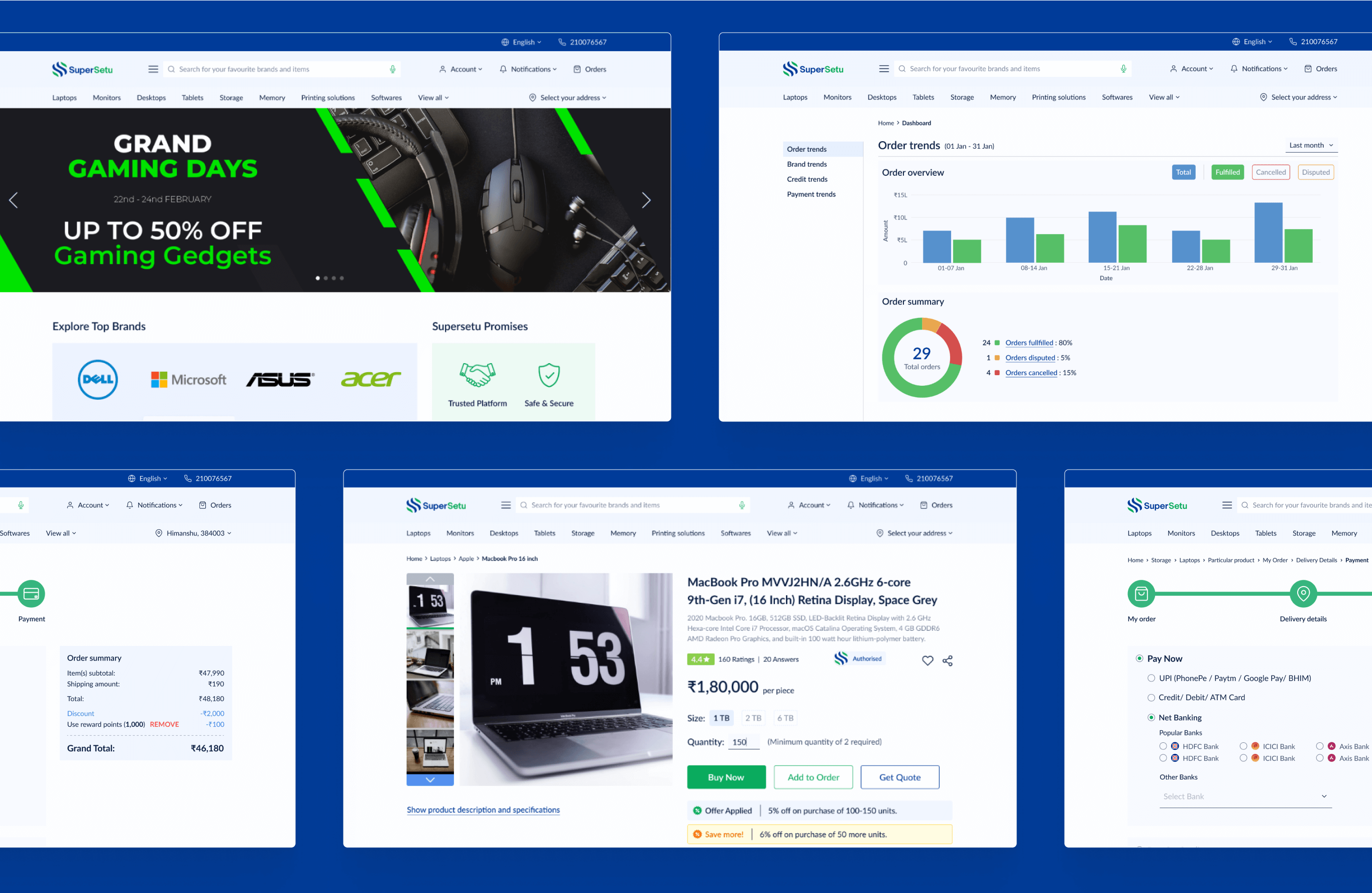
SuperSetu is a B2B transparent E-commerce platform for dealers and distributors to explore best deals on electronic goods and place orders with Supersetu. It is on a mission to make business more efficient, organized, and convenient for our partners and retailers across India.

To improve ease of tracking various details of orders placed (date of order, delivery, status).
Increase the various modes of payments to ensure easy and secure transactions.
Customers often miss out on rewards & incentives due to lack of clarity.
To ease the processes of complaints and replacements/ refunds.
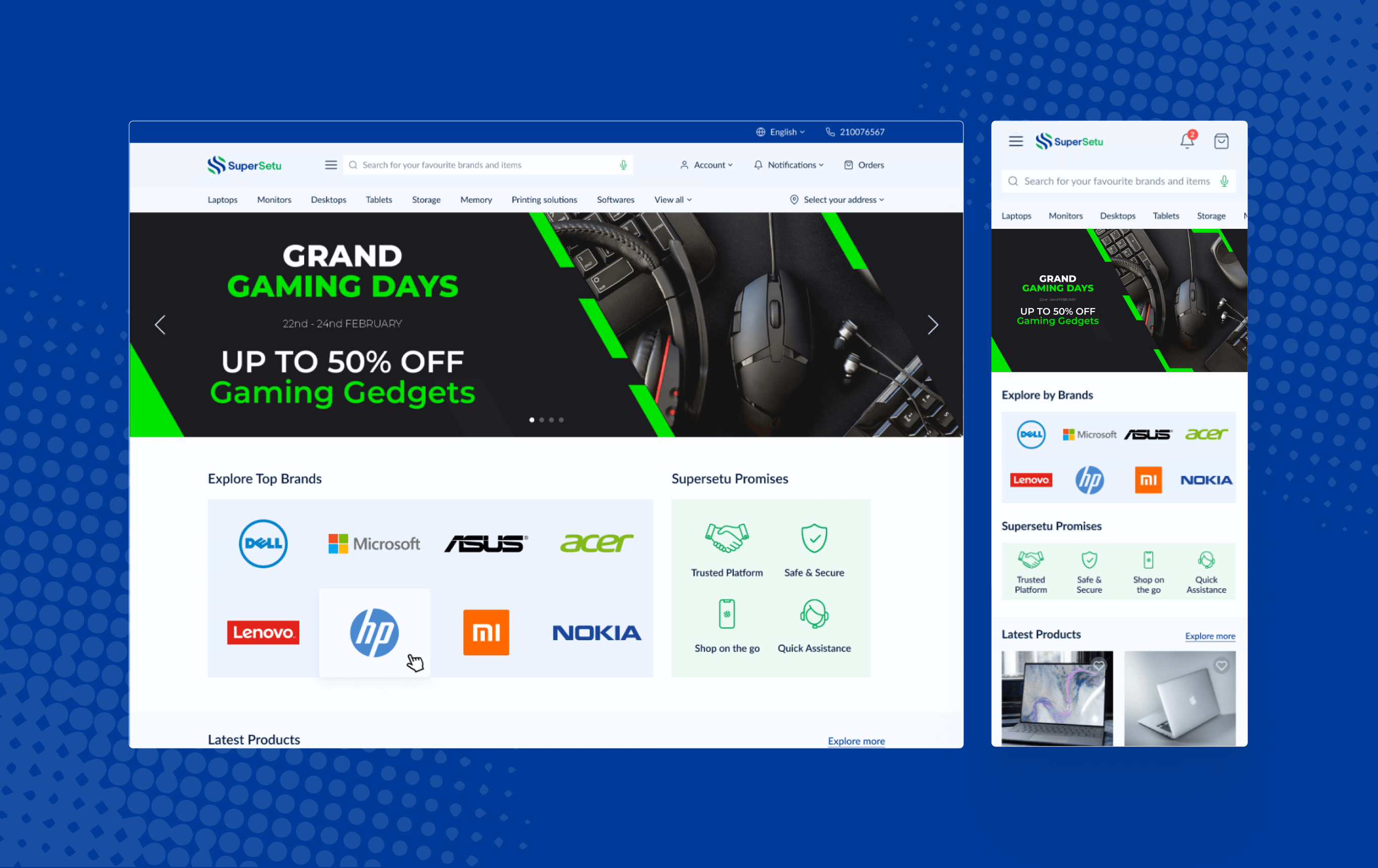
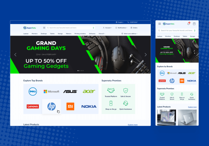
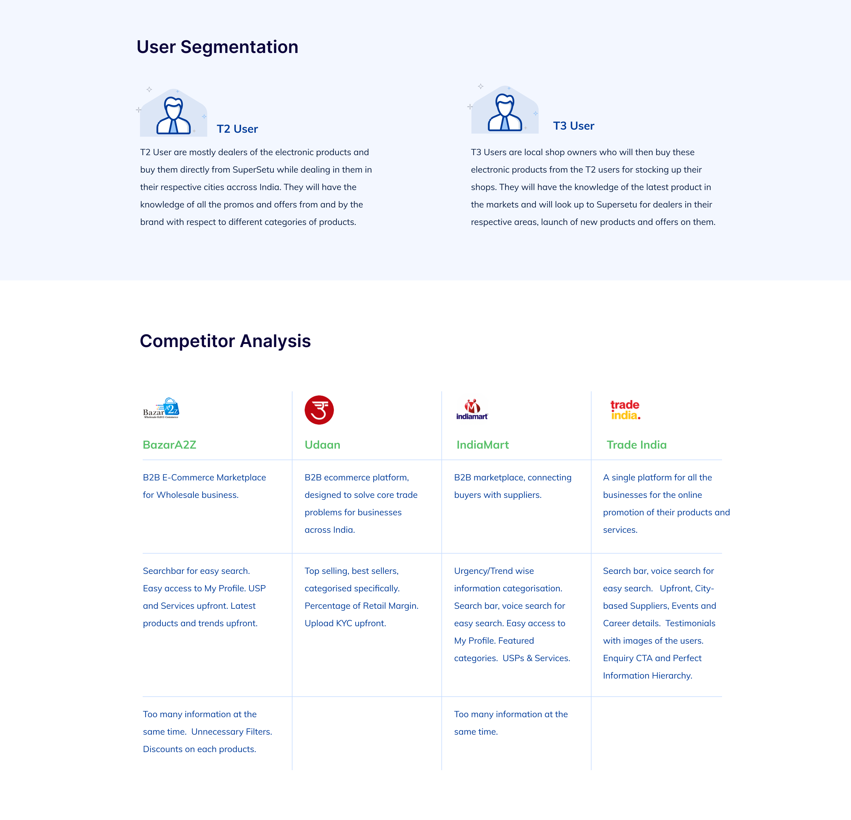
From competitor analysis and data used for the customers, we have made a landing page that is meaningful and futuristic. The page content was designed keeping in mind the different user personas created as a part of the research process.

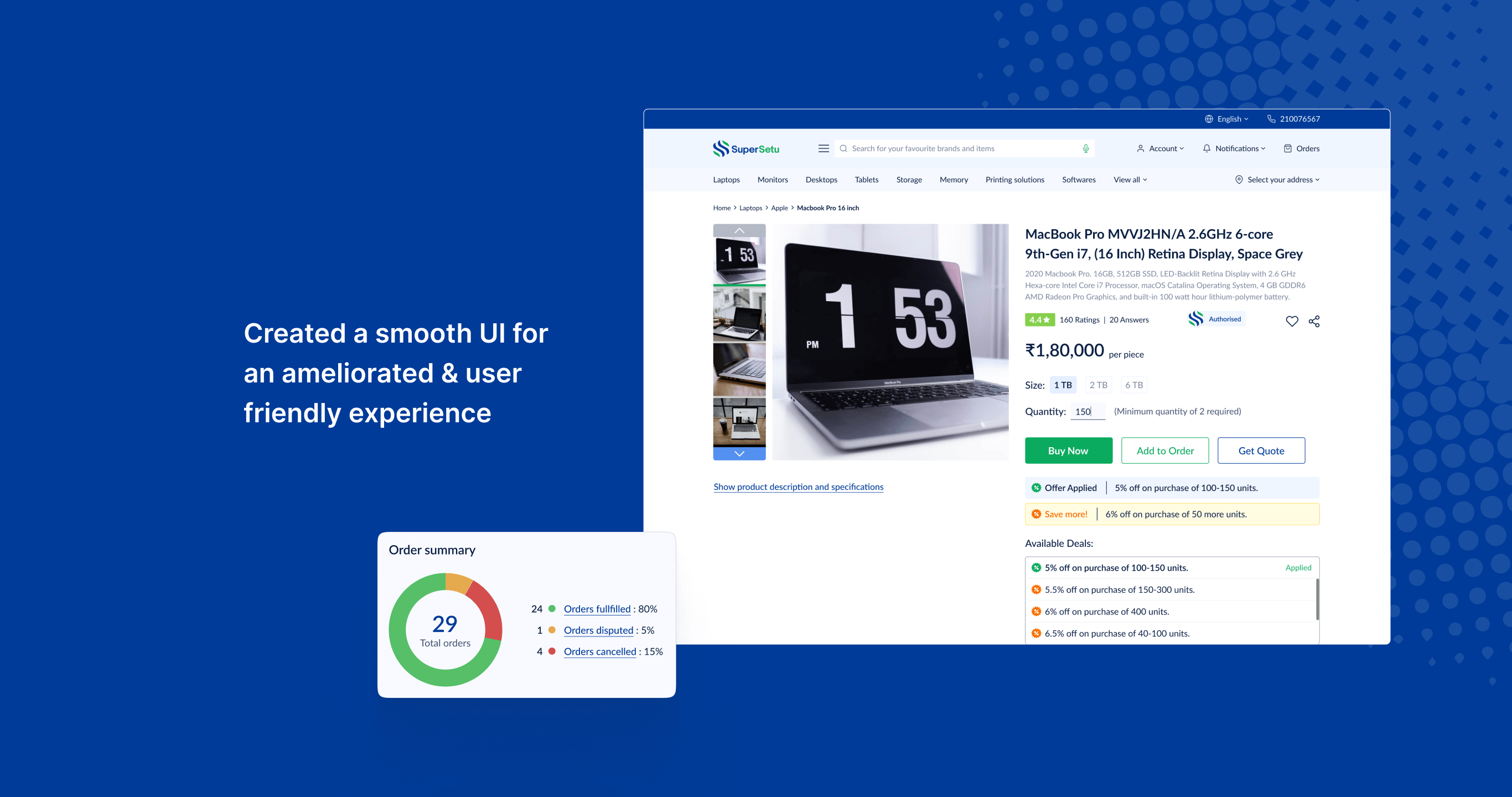
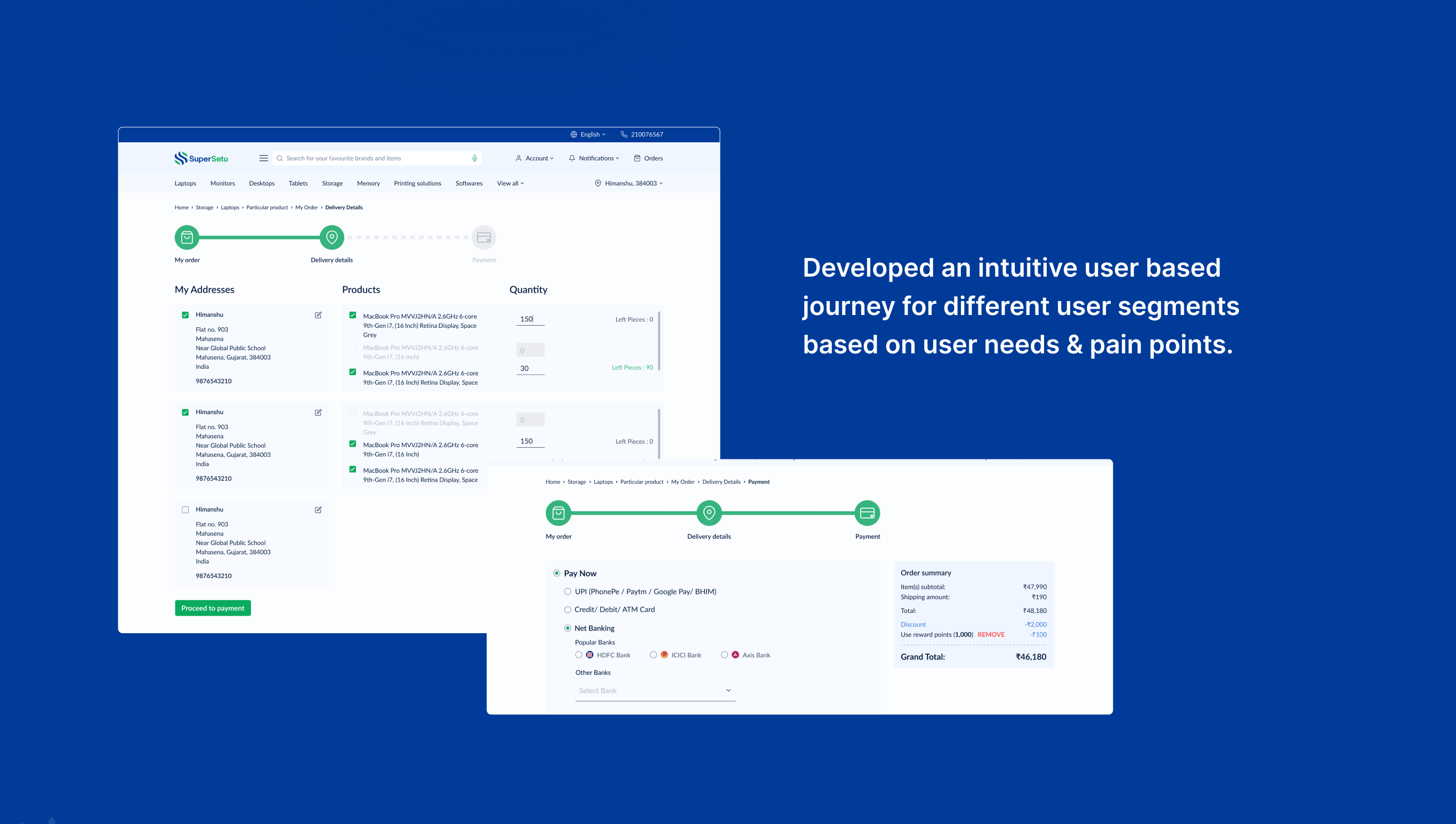
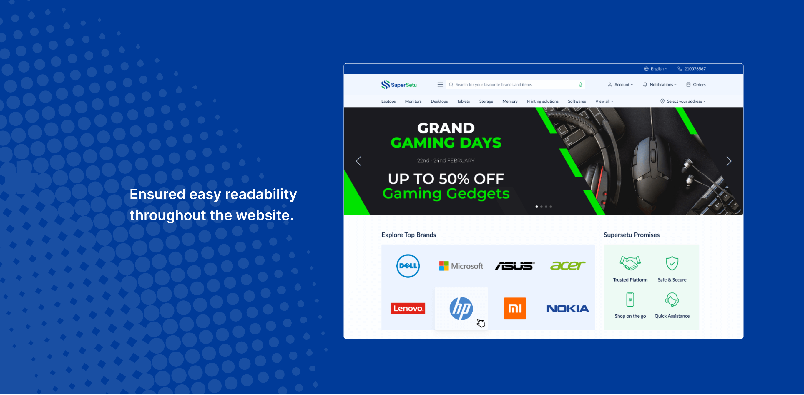
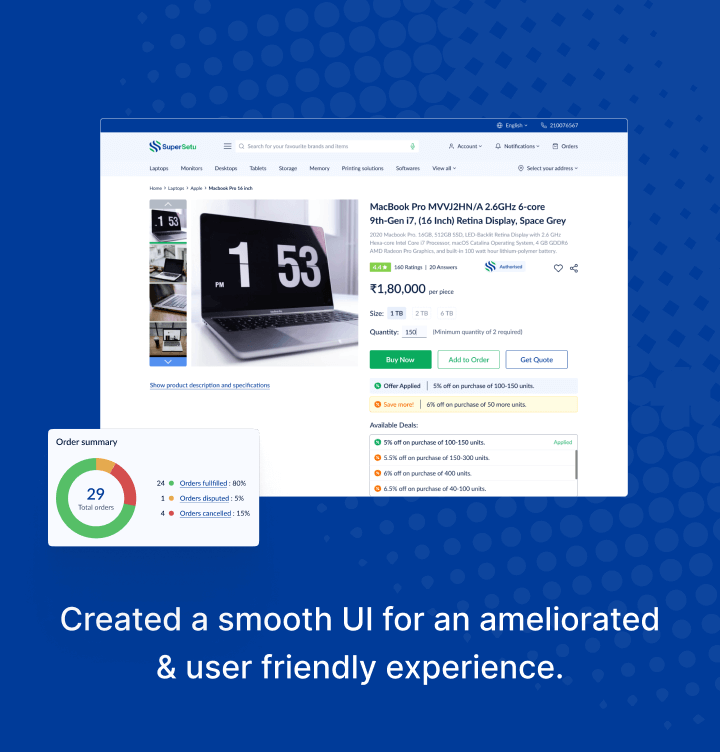
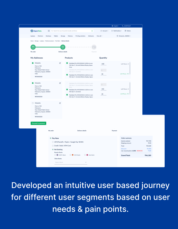

The blue in the palette signifies trust and sophistication, while the green signifies growth. The principle of 60 percent + 30 percent + 10 percent is the best proportion to achieve color balance in a visual design and was hence used. The typography which was chosen is Lato, a Google font to serve the developers better. It is user-friendly as well as depicts simplicity and modernity. We have also used a set of Outlined Feather icons, which looks minimal yet doesn’t take away attention from other elements on the interface.
Tell us everything about your product or venture. Fill out the form, or if you prefer send us an email.
Tell us everything about your product or venture. Fill out the form, or if you prefer send us an email.