Are you familiar with the UI’s ‘Magic Number 7’?
Any UI Company which makes excellent UI designs understands that a human brain can recognize and only store up to 5 +/- 2 elements or lesser elements in one glance.
The user interface design happens during the later stages of the product development UI UX Design process. After extensive user research, the UI design builds upon what has been defined by the UX design. By adding the right styles and interactions, an ideal user experience is built.
Although the following steps of UI design are presented linearly, you don’t have to follow them as is. Some of these steps may vary as the design changes after rounds of testing and iterations.
Understand the Pain Points
Understanding the problem that you’re trying to solve, makes the UI Design process for a UI design company way easier. The design teams should use the briefs, which provide a general understanding of the project.
These briefs facilitate the definition of responsibilities and deadlines, which gives you an understanding about:
- Background: The cause behind the project.
- Goals: What the UI company is trying to achieve from this project? How does it benefit the user? How does it help the company?
- Target audience: Who is this product targeting?
- Success criteria: What metrics, OKRs, and KPIs are you using to demarcate the project’s success?
- Team structure: Who’s involved in this project? What are the responsibilities of each associate? Who are the stakeholders associated with the project?
- Scope: What is needed from the team to complete the project?
- Deadline: When will this project be delivered?
Competitor Benchmarking
Early in the procedure, you should look for inspiration that your team can use as a reference once they start designing the UI.
You want to see what UI components the top UI company or agencies are using while presenting a screen, interaction, or user flow. Sites like Dribbble or Behance are perfect for this.
Let everybody in your team choose any component that they like. The point of this is to see the approach that each member would like to take.
Once your team has gathered some concepts, you can create a UI inventory. This interface inventory is a directory that represents all the UI elements you could use, including files from a design tool like Figma.
In your inventory, you want to categorize each UI element in large groups such as:
- Animations
- Color
- Input components (e.g., toggles, buttons, etc.)
- Information architecture structures
- Typography
- Informational components (e.g., message boxes, tooltips, etc.)
Define Screens and User Behaviors
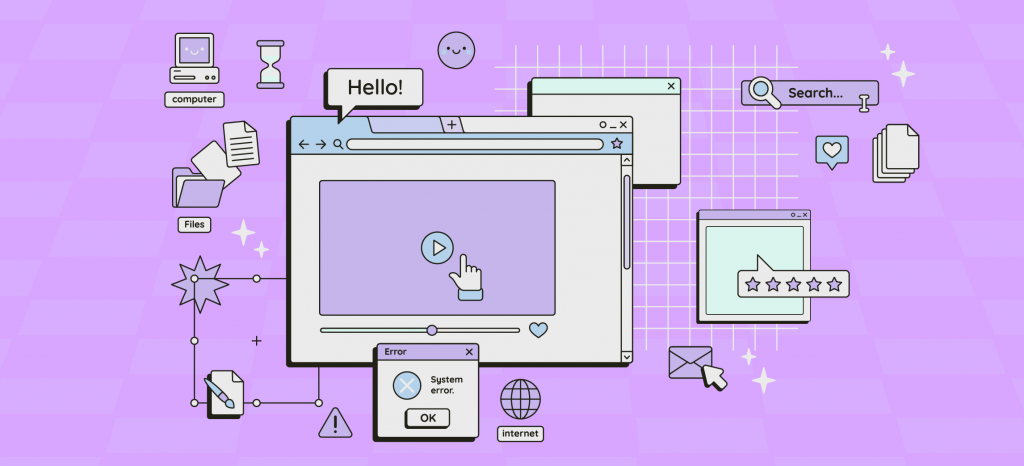
The design brief should demonstrate the screens your team will design the UI for. If it’s not clear, have another session of briefing. Any UI company should visualize everything their team needs to work on and how the screens map the user journey.
Note that these are screens and not pages. Screens emphasizes mobile devices, apps, and browsers, and the changes in resolutions and layouts each screen will have once they adjust to different devices.
Develop Sketches and Wireframes
The design team of your UI Company can start creating sketches that illustrate potential screen layouts with the screens defined. One should aim to get a high-level idea of the different ways the interface could meet the user’s needs.
Every design team member should discuss and develop ideas with the relevant stakeholders to find the correct combination that gets users to finish each task efficiently without leaving the app. Once you have specified the right sketch for each screen, you can start working on the wireframes. These low-fidelity prototypes define each screen’s visual hierarchy and structural guidelines.
Examine your wireframes with the relevant stakeholders to get a better understanding of the project’s development. It will give you a clear idea of the timeframe and how the final product will look.
You should also test your low-fidelity prototypes with the end user to find the best layouts and catch any critical usability problems before the development starts.
Develop and Maintain a Design System
Before you proceed to higher-fidelity prototypes, the UI Company needs to define the exact components to be used with the help of design systems.
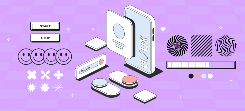
A design system batches every UI element that will allow the team to design and develop a product. It will constantly evolve with the project, tools, and new technologies available. A design system is like a library of reusable components that provides clarity and consistency throughout the UX design process.
The various elements that make a design system are:
- The colors that represent the brand
- The imagery
- The typography
Another advantage of a design system is that it gives developers more specific input on what they are supposed to code. The stakeholders will also get a clearer idea about the complexity of the prototypes.
Also Read – The UI/UX Design Industry: A Beginner’s Guide
Design High-Fidelity Prototypes
Finally, your team can start building high-fidelity prototypes, which include all the previously defined design elements.
However, the prototype won’t look exactly like the finished product; the purpose is to present a user flow to both stakeholders and the users that you can discuss and test.
The major difference between the high-fi prototype created by the UI company and a wireframe is that the former is interactive. It includes features such as page scrolling, accordions, checkboxes, and more. It also provides details such as the copy, graphical elements, and user flow you’d like to employ once you launch your project into development.
Since high-fi prototypes look nearly like the finished product, you can use them in user testing sessions and get feedback before disbursing further resources on marketing and development. Although UX designers are accountable for deploying this task, the UI team can contribute with the former to respond to the user feedback and create new iterations of the prototype until they have a definitive version.
Hand-Off
Once the high-fidelity prototypes are created, it’s time for the hand-off. In this final step, you present the finished product to your stakeholders and discuss the changes made.
Before the hand-off, the UI company should document the specific changes made to the product. You can do this with the help of any major design tool, such as Figma, Zeplin, Sketch, and InVision.
You should also be ready for the feedback, which will require you to go back to earlier stages. But if you have done your UI UX Design process correctly, there won’t be any major changes.
Conclusion – Additional Important Tips
As the UI design complements the UX Design process, taking your early wireframes into functioning prototypes that aim to delight and encourage your users is a fulfilling feeling. Here are some additional tips that any UI company should keep in mind.
- Involve your stakeholders in every step along the UX Design process. Ensure that there’s a two-way relationship between the design team and the stakeholders. This way, the discussion and direction during the changes become easier. Implement the feedback received instantly, to avoid any problems in the later stages of the design and development cycle.
- Test your designs, like the wireframes and prototypes, to avoid any usability or accessibility issues.
